Chinaberry Rebrand
Chinaberry was acquired by South Meadow Ventures in late 2015, and still carried a great deal of its branding from its founding in the 1980's. Though classic, the branding felt old and outdated by the time of its acquisition, and after a period of steady adaptation and transition, it was decided a total rebrand was needed in 2017. I was given the project to redefine its visual identity from the ground up, carrying Chinaberry into the 21st century.
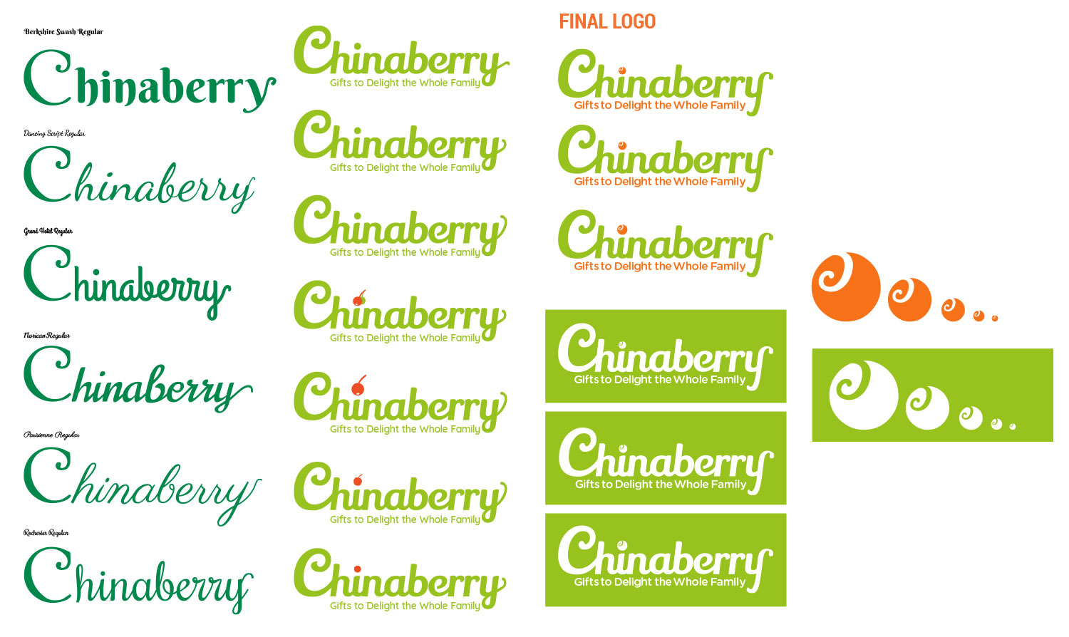
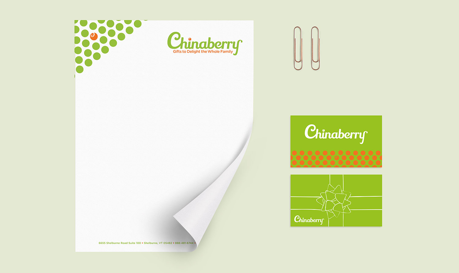
I turned first and foremost to Chinaberry's logo, which had remained the same from the company's founding and traveled across several designs, artistic styles, and now parent company's. Deep, mature green, it had been hand-lettered and resembled much more closely the logos show on the left of the redesign process. What was iconic was its swooping 'C' with its own fairy-like hook at the top, and it was that swoop I wanted to carry forwards into future iterations, as it held a history and playfulness that the rest of the logo almost lacked. I wanted to push the rest of the logo into the same playfulness, to make it breathe fun, to make it as connected to childhood exploration and play as the toys and books Chinaberry focused on. I moved the old logo into steady iterations of newer typefaces, testing the merit of keeping a classic 'cursive' or serif look or pushing it into swooping, playful letters more in-line with the C's own hook. Rigid, straight cursive felt to carry too much history and not enough play or fun, seeming better at place on the front of an adult's fiction book than representative of children's gifts. Still, swooping and cursive letters were tied to the old logo, and so instead I iterated on finding something that felt bold, friendly and rounded while still calling back to that deep history of the original branding. In this next round of iterations, the C's swoop was much more rounded, and the letters bubblier to invoke this new direction of total playfulness, and a more vibrant, exciting green was chosen to still callback to the original shade while pushing the brand forwards. I also experimented with turning the dot of the 'I' into a berry, a nod to the tree the brand was named for while adding an extra bit of play to the logo, and creating a swoop on the 'Y' that would call back to the 'C'. This concept was refined until the original swoop of the C was totally rounded to blend with the lettering and tie to the "berry" above the 'I', the swoop on the 'Y' made more conservative and looped to almost appear like an inverse of the C's own, tying the logo back into itself like a rollercoaster. The berry was also refined further, the swoop repeated within it, and had the ability to be pulled out as a clear icon for the brand. Orange was chosen in favor of a yellow-gold used by the original branding to compliment the bright green in its vibrancy. Overall, I pushed the logo to be fun and playful within itself, while still nodding back to its history as a small company begun by a mother looking to share books she had found for her children.
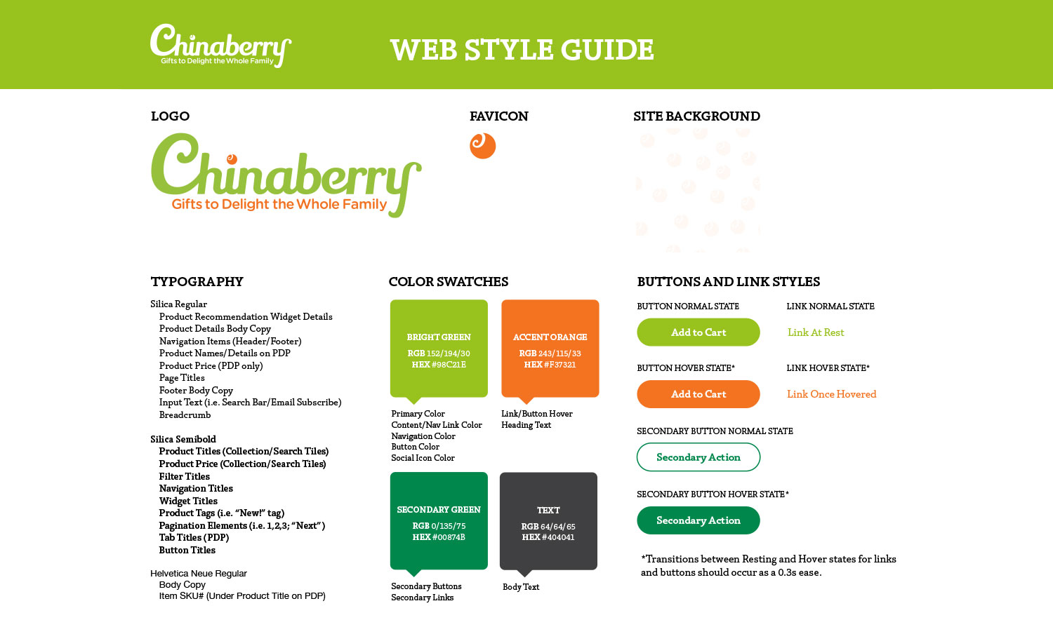
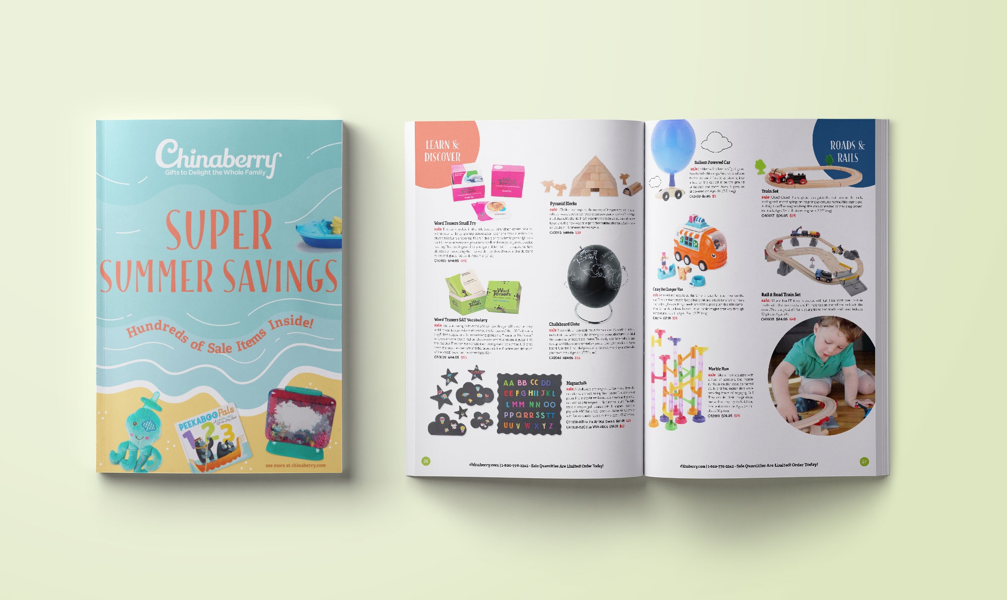
It was important to carry this light-hearted playfulness into all the new branding for Chinaberry. I wanted to pull the bright coloration of the new Chinaberry forwards into branded materials, such as letterhead, gift cards, and envelopes, celebrating the iconic Berry and the open, friendliness of color and circular shape. Corporate letterhead, for Chinaberry, shouldn't be totally stiff, but could find a middle ground between reservation and reflecting the value put on fun and playfulness. Gift cards were decorated with patterns of bright circles and the Berry at its center or hand-drawn ribbons to bring Chinaberry back to a more friendly, casual look and feel. These illustrations, which also made their way into catalogs and across branding on the web also acted as a quiet nod back to old artwork of hand-painted covers, and decor elements like fairies, mice, and rabbits that once covered Chinaberry's catalogs in the 80's and 90's, but which had fallen out of use in later years; I felt there had been something so wonderfully personal to that artwork, something in the dedication shown to their creations that made Chinaberry feel alive and breathing, that invoked its power of imagination and playfulness, and I wanted to return to that in this new iteration.
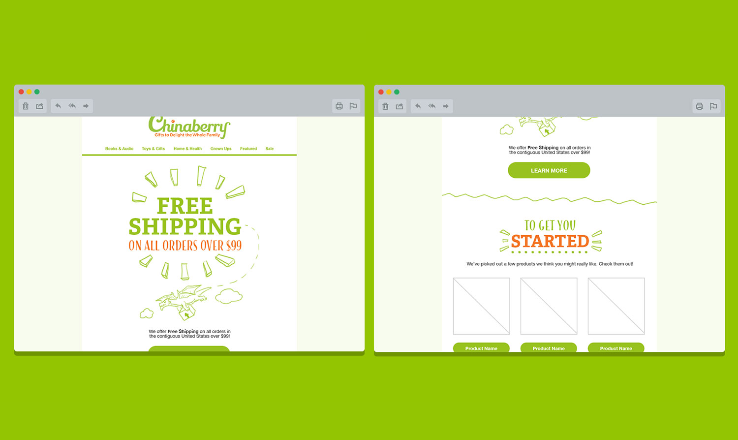
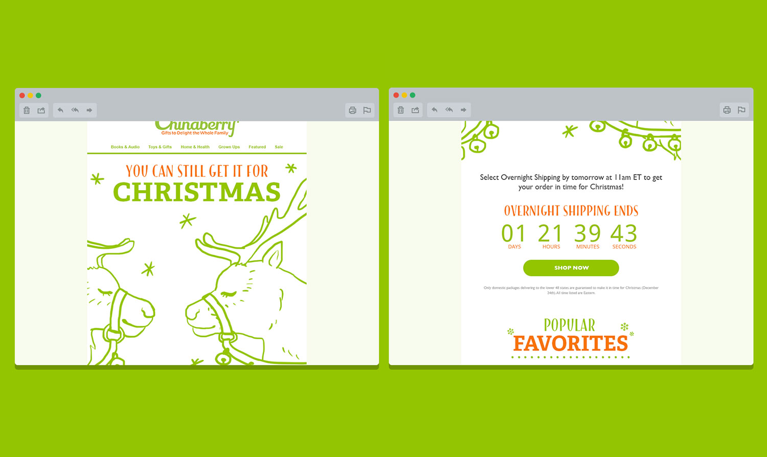
Chinaberry, since its acquisition in 2015, had seen some work done to its online presence both on its website and within its emails to modernize it, but now it was time to take it to the next step. Following the vibrant colors, playful illustrations, and light-heartedness of the new branding, I redesigned Chinaberry's email templates and email notifications to better reflect this new turn in the branding and make sure that the new emphasis on fun and playfulness carried from print into its digital presence as well. I pushed the power of illustration further in these digital spaces, trying to turn customers’ screens, which can sometimes feel cold or distant, into living, breathing spaces that would pull them in and immerse them in Chinaberry's reiterated values.