THE GROMMET
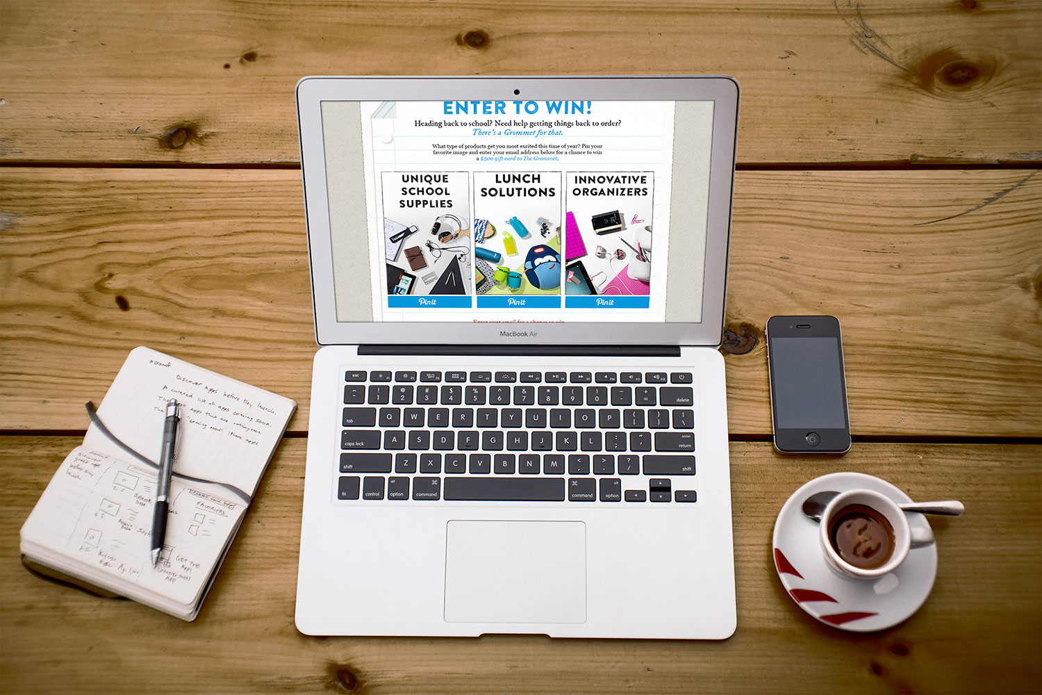
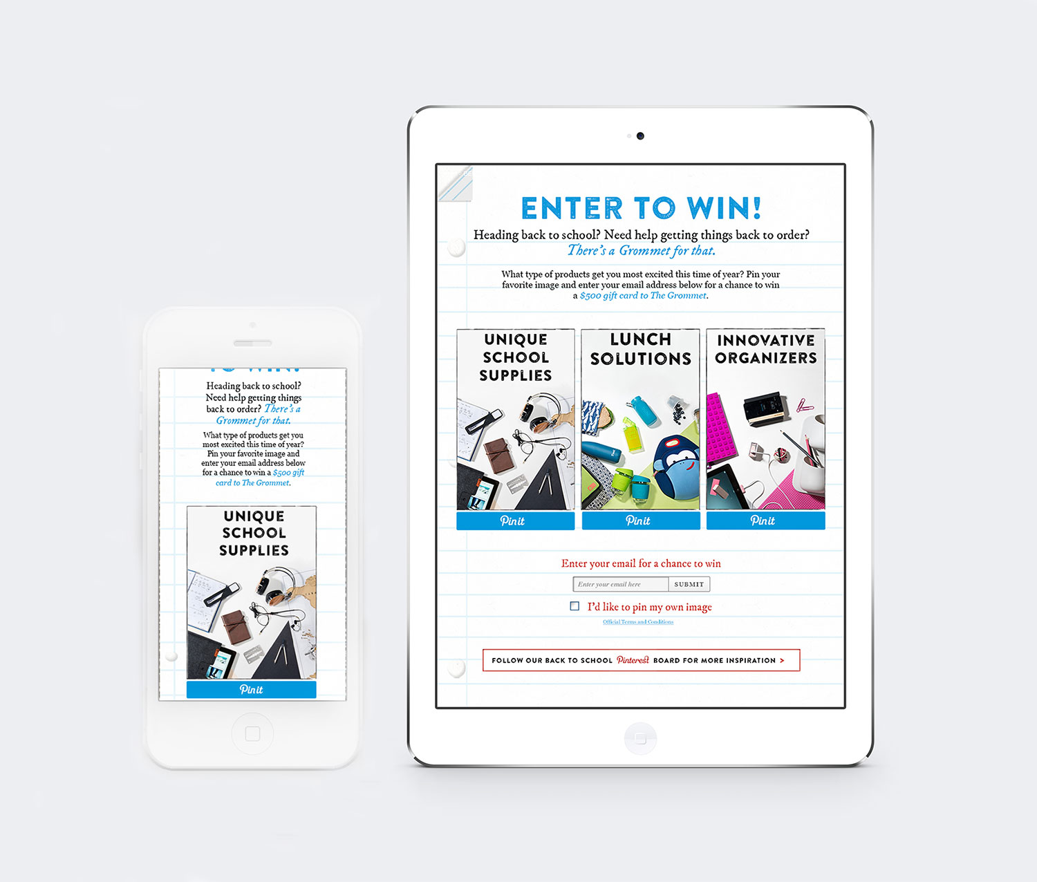
At The Grommet, I assisted in the design for a Pinterest competition for Back to School supplies, creating a landing page that would scale well across devices; for laptop or desktop, a lined-paper background against the normal beige of The Grommet site combined with rustic typography and bold image to invoke a school notebook. On tablet and mobile, the beige is cropped away so that the lined paper takes precedence, and images shift to be the full-width of the landing page on mobile. Bold call-to-actions make the intent of the campaign clear and entering simple: Pin your favorite category of back-to-school supplies to have a chance to win a gift card. The goal was to make the intent of the campaign simple at a glance, and to make it simple to participate in the competition itself.
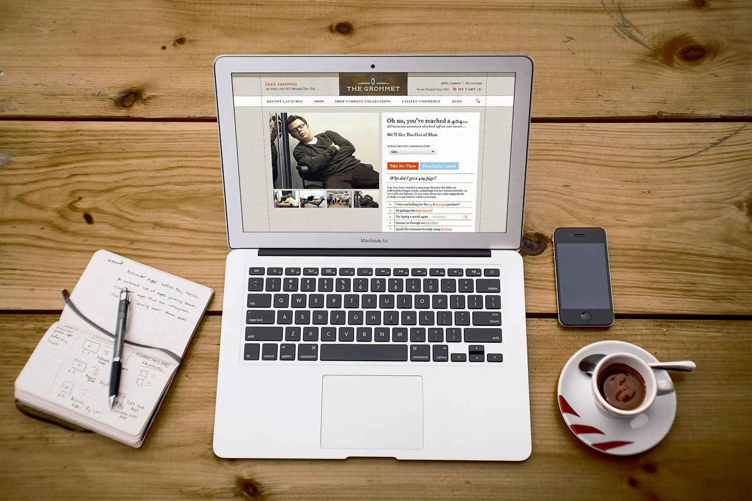
I also designed the preliminary concepts and compositions for a redesign of The Grommet's 404 page, which acted as the base concept for the final design now hosted on the website. I wanted to create an experience that was humorous and light-hearted, lessening the frustration of hitting a 404 page. The 404 would mimic a product page on the normal site, hosting goofy images of the team slacking off (a joke that The Grommet had failed the user and got them to a 404) in place of product images. In place of the normal product description, a drop down would help users reach the pages or section they may have been trying to reach, or a search bar to help them try again. The 404 was designed to fit well with the familiar pages of The Grommet's website while still being humorous, unique, and helping users find their way easily.