Catalog Design
As the Senior Graphic Designer at South Meadow Ventures, one of my responsibilities included the layout, design, and print-preparation of catalogs for the three brands owned by the company: Nova Natural Toys & Crafts, Isabella, and Chinaberry. Isabella and Chinaberry often sent two–three catalogs a quarter, while Nova often sent catalogs in the second halves of the year, which several mailings close to the holidays. This required each catalog be produced in a timely fashion, with awareness of the timetables on the production of all three, and with branding that was unique to each without crossing into each other, even as their design was carried out simultaneously.
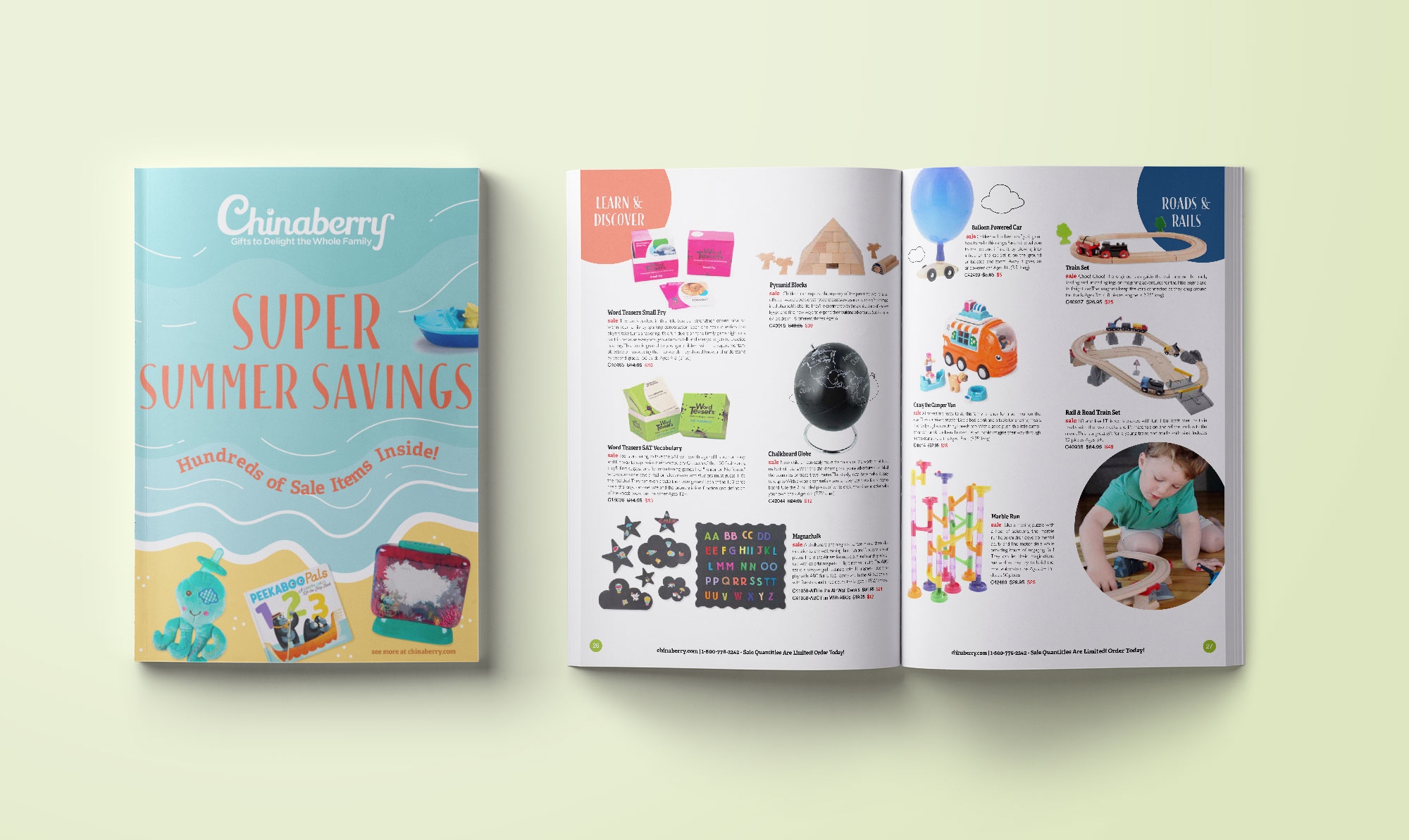
Chinaberry, with its wide array of toys across low to high-end markets, carried its playful, illustrative branding to its catalog pages, using shape, color, and illustration to bring the products it represented alive. I wanted images to be large, revel in their whitespace, and for illustrations to support the purpose or imagination of the products to invoke the playfulness and fun of a kid's toy catalog. We wanted Chinaberry, which had once been sterile in its branding, to move forwards into a new age where the name would be synonymous with play and laughter.

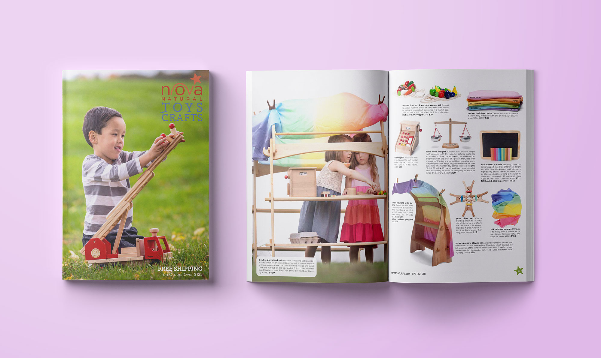
Like Chinaberry, Nova Natural carries children's toys, games, and accessories, but focused on natural, organic, higher-end products. Like Chinaberry, to emphasize the creativity and play at the center of its mission with the products it carries, I broke the grid of the catalog frequently, allowing products to puzzle together within whitespace to give the idea of a down-to-earth, open whole; rigid grids or controlled space would only detract from Nova's celebration of free-form play and the power of imagination. However, with the products it carries and Nova's focus on the moment of play, large, page-filling lifestyles supported knockouts opposite them, to truly commit to showing their products being used, explored, and taken to new creative heights. I wanted readers to feel as if they were walking in and around the products they were seeing, and to imagine them in their own kid's lives, using the large lifestyles to help them invoke those images.

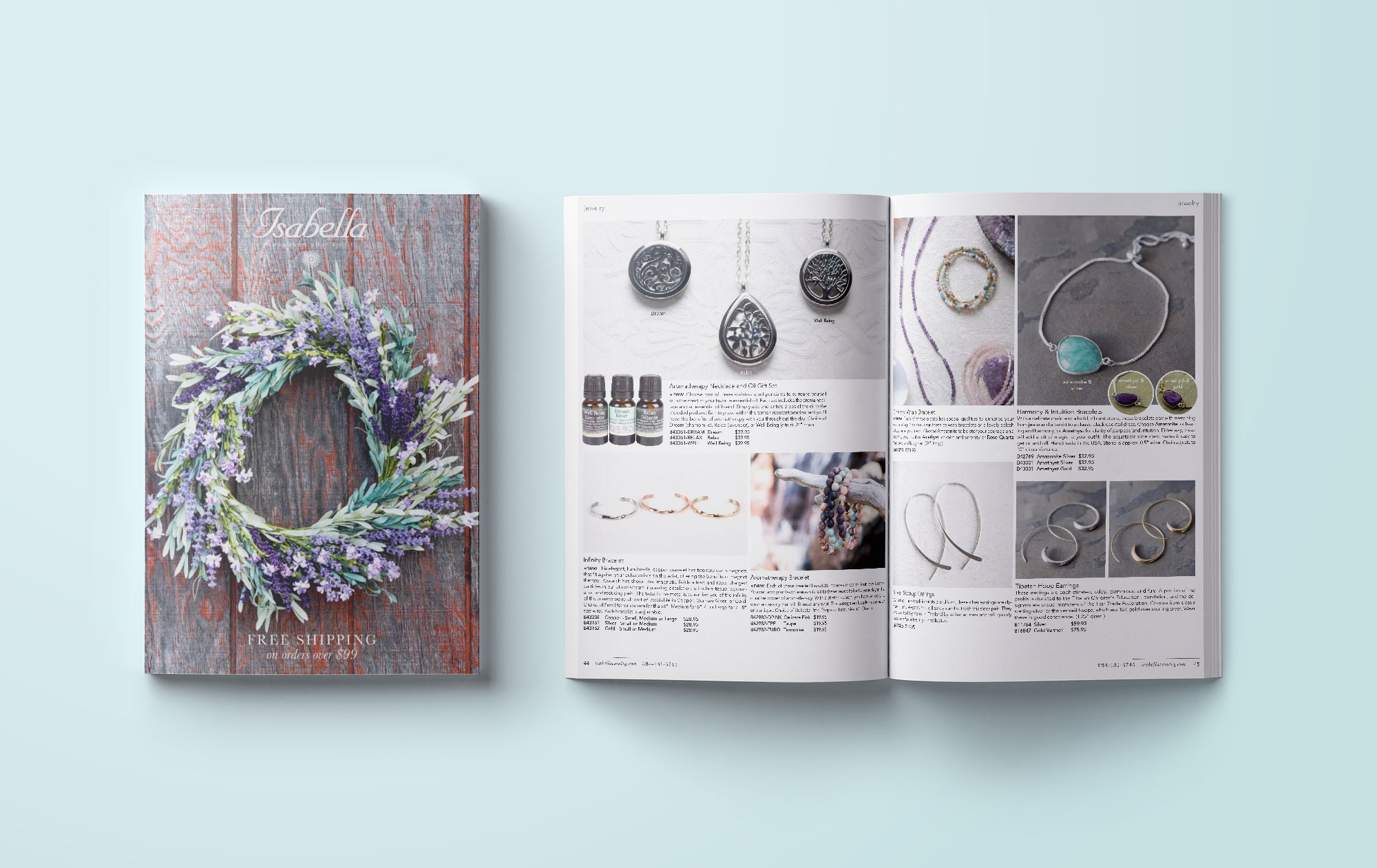
Isabella, in contrast to the other two, spoke to a more mature audience and carried an array of products for the home, garden, and health, as well as accessories and cosmetics; Chinaberry's light-hearted illustrations and playful branding or Nova's celebration of imagination had no place here; it was important that to never cross the three designs or it would muddle the message of maturity Isabella carried. Instead of round, playful shapes or liberal whitespace, I focused instead on invoking the grace and maturity of Isabella through large lifestyles, careful grids, and conservative whitespace that gave way to product and description. Isabella, with its dedication to lifestyle, needed to reflect that in its large, clear presentation of its products with as many lifestyles to show their place in the home, for the individual, or as a part of one's space as possible.

